Microsoft Logo Assignment
The original Microsoft logo was created in 1975 by Bill Gates in a program called BASIC. This resembled the disco-esque style of the 70’s and was created in less than a day.
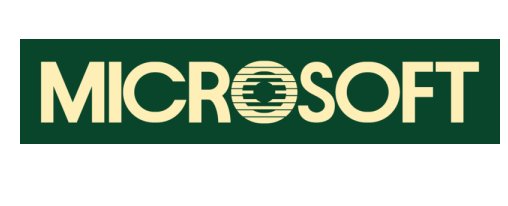
The more memorable logo in Microsoft’s early days was made soon after the last logo was created. This logo had a more uniform font style with a stylized ‘o’. This ‘o’ became known as the ‘blibblet’, and it had caused much controversy when it came time to change the logo again. In fact, and unsuccessful “Save the Blibblet” campaign was launched in order to protect the cute, friendly symbol. However, the significance of this design element is not entirely clear. Perhaps it was purely meant to convey friendliness?
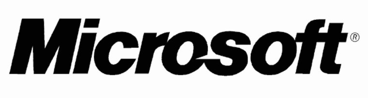
The logo that had lasted the longest became known as the Pacman logo, the name being inherited from the subtle clefts in the ‘s’ and ‘o’ in Microsoft. This, along with the modern, italicized Helvetica font was meant to emphasize the ‘soft’ in Microsoft, and to convey a sense of speed and motion, which would in turn convey efficiency.
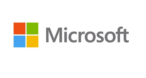
The Pacman logo, while enduring a long series of slogans and taglines, finally made way for a new logo once the ‘revolutionary’ Windows 8 was set to release. So, in 2012, the company changed its logo for something even more modernized and, supposedly, more revolutionary.
This new logo had, so far, the most thought put into its symbolism than all the past logos combined. First of all, Segoe is the font the company has used as default for their products, so to use it for the logo would provide cohesiveness. As for the artwork, it is meant to represent Microsoft’s “diverse portfolio of products.” Personally, I also feel that it resembles Microsoft’s line of Windows software, the name and symbols of such appearing to represent ‘windows of opportunity.’
No comments:
Post a Comment