
Thursday, January 7, 2016
Monday, January 4, 2016

Thursday, December 17, 2015

Monday, December 14, 2015
Monday, December 7, 2015
Monday, November 23, 2015
Logo Significance - Writing Assignment
Microsoft Logo Assignment
The original Microsoft logo was created in 1975 by Bill Gates in a program called BASIC. This resembled the disco-esque style of the 70’s and was created in less than a day.
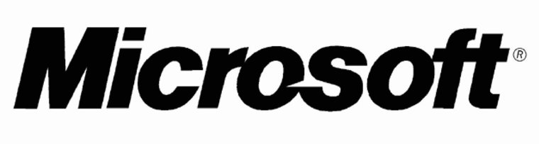
The more memorable logo in Microsoft’s early days was made soon after the last logo was created. This logo had a more uniform font style with a stylized ‘o’. This ‘o’ became known as the ‘blibblet’, and it had caused much controversy when it came time to change the logo again. In fact, and unsuccessful “Save the Blibblet” campaign was launched in order to protect the cute, friendly symbol. However, the significance of this design element is not entirely clear. Perhaps it was purely meant to convey friendliness?
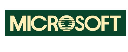
The logo that had lasted the longest became known as the Pacman logo, the name being inherited from the subtle clefts in the ‘s’ and ‘o’ in Microsoft. This, along with the modern, italicized Helvetica font was meant to emphasize the ‘soft’ in Microsoft, and to convey a sense of speed and motion, which would in turn convey efficiency.
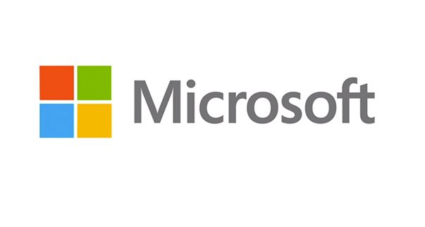
The Pacman logo, while enduring a long series of slogans and taglines, finally made way for a new logo once the ‘revolutionary’ Windows 8 was set to release. So, in 2012, the company changed its logo for something even more modernized and, supposedly, more revolutionary.
This new logo had, so far, the most thought put into its symbolism than all the past logos combined. First of all, Segoe is the font the company has used as default for their products, so to use it for the logo would provide cohesiveness. As for the artwork, it is meant to represent Microsoft’s “diverse portfolio of products.” Personally, I also feel that it resembles Microsoft’s line of Windows software, the name and symbols of such appearing to represent ‘windows of opportunity.’
Friday, November 20, 2015
logo design notes
*logo, branding and identity*
what is a brand
- the perceived emotional corporate image as a whole
- the reputation both claimed and received
branding
- the control over a public image
- a designer can create the framework for a brand, colours, artwork, style.. but the audience completes the brand through an emotional reaction to it
- example - apple is an IT company that projects a humanist image. + corporate ethics, and support of good causes
- when people use the products they connect to the brand emotionally
what is identity
- corporate identity is comprised of the visual aspect that forms a brand
- close attention is paid to executing a consistent experience for the viewer
what is identity design
- corporate identity includes strict usage of colours, font families, graphic elements and other guidelines, usually detailed in a corporate identity guide
- can include the logo, logo variations, business cards, labels, envelopes, letterhead stationary, advertisements. tv commercials, packaging, etc...
what is a logo
- for identification
- simplest way a company or organization can represent itself, through the use of a mark or icon
logo design
why vector art
- powerful, flexible and easily edited, which is important when clients want to make changes
- can be scaled up infinitely without losing quality
pencil to vector
- logo design requires many phases
- meetings and review sessions are required to arrive at a design that works
- converting sketch to vector requires graphic style, colour, line shape, and typography
final art: graphic style
- decide what your "graphic style" will be
- examples - will it be bold, simple and cute? sleek, technical, and sedate? cartoony, fun, and cool? high tech and 3d?
- wide range of styles to choose from, and choose a style that fits your concept & market
line quality
- refers to the smoothness and precise nature of your lines
- use pen tool to establish this
- take time with this, and if it doesn't work right try again!
line shape
- important to consider if logo contains lines
colour matters!
- makes a huge difference
- use colours appropriate for your design
rules for logo design
4 rules
- describable
- effective without colour
- memorable
- scalable
design styles
- typeface focus relies on typeface to create the design, creativity is utilized in the proximity, contrast, colour, customization of the letter forms
- mixing typefaces, which uses two different type faces to create a design. strive for balance and contrast
- typeface plus graphic element. which uses a simple, abstract graphic element in addition to the typeface to create emphasis
- typeface plus shapes/symbols. this achieves an even balance between art and typography
- graphic focused design, where graphic elements are the focus/dominant aspect of the design and the typeface plays a supporting role
Subscribe to:
Posts (Atom)